Redesign Attachments in VKontakte
Unified VK Feed attachments with a Primary/Secondary card system and a “Free Height” compromise—improving predictability, accessibility, and CTR without sacrificing performance.
Company
Vkontakte
Role
Product Designer
Product
Newsfeed
Project Overview
In the VKontakte news feed, the Time Spent metric (user engagement time) is of paramount importance. The more time a person spends in the feed, the more revenue the company generates from advertising. Therefore, our global objective is to increase this metric. Through research and a series of AB tests, we have concluded that there are several issues that need to be addressed in order to boost the Time Spent metric.
In the course of working on this task, it's also essential to consider that the platform already hosts a wide variety of content formats, namely:
Photos, Music, Polls, Files, Products, Services, Geopoints, Clips, Videos, Articles, Albums, Stickers, Podcasts, Stories, Mini-Apps (Services), Playlists, etc.
Now that you have this information, we can move on to the next part, specifically, the problems that have been identified.
Problems
Post Height
The issue here is that due to the variety of content formats present in the feed, there is a problem where users may post extremely tall posts that take up 2-3 scrolls in the news feed and attract more attention. When viewing such a post, a user may simply get bored and leave. Many communities took advantage of this and could literally create enormous posts to grab attention, diverting it from other authors. This scenario was simply unfair to everyone, as reach should not depend on the size of the post.
This can be understood by considering a situation where one author gathers an audience through text content, while another does so through photos. If the second author posts extremely tall photos, they will undoubtedly receive more reach than an author who, for example, writes poetry.
Differences in Attachment Formats
The next issue was that each format, in most cases, significantly differed in visual composition and could occupy varying heights, which also had a negative impact on reach. For example, below you can see how much attachments lose out in comparison to playlists.
Communication Between Teams
VKontakte is a large organization where each product is managed by a sizable team. In brief, for each attachment format listed here, there is an entire department responsible. Metrics are also crucial for each of them, so within their respective products, it's essential for them to ensure that after changing their attachments, metrics not only do not decrease but also increase.
Different Platforms
In addition to this, all solutions must be suitable for all platforms because we follow an approach in which the entire VKontakte product should have a unified appearance on all platforms: Android, iOS, Web, and mVK (mobile version).
The task, to put it mildly, is not an easy one, but solving challenging tasks is like a trial for me!
Solution
The most challenging problem, as it often happens, is reaching an agreement. Naturally, each product will do everything it can to distinguish itself because it will boost their metrics. However, our task as the feed team is to ensure that all products have a uniform appearance and equal rights. To begin with, we gathered for a brainstorming session where we outlined the key principles to make it easier and faster for everyone to understand what we are aiming for and where we are headed.
Next, we agreed to prepare concepts for what the future news feed with attachments from each product could look like. In the end, we arrived at a unified format, namely - the concept of Primary and Secondary attachments (hereinafter referred to as this abbreviation). What are they, and how do they differ?
Next, we agreed to prepare concepts for what the future news feed with attachments from each product could look like. In the end, we arrived at a unified format, namely - the concept of Primary and Secondary attachments (hereinafter referred to as this abbreviation). What are they, and how do they differ?
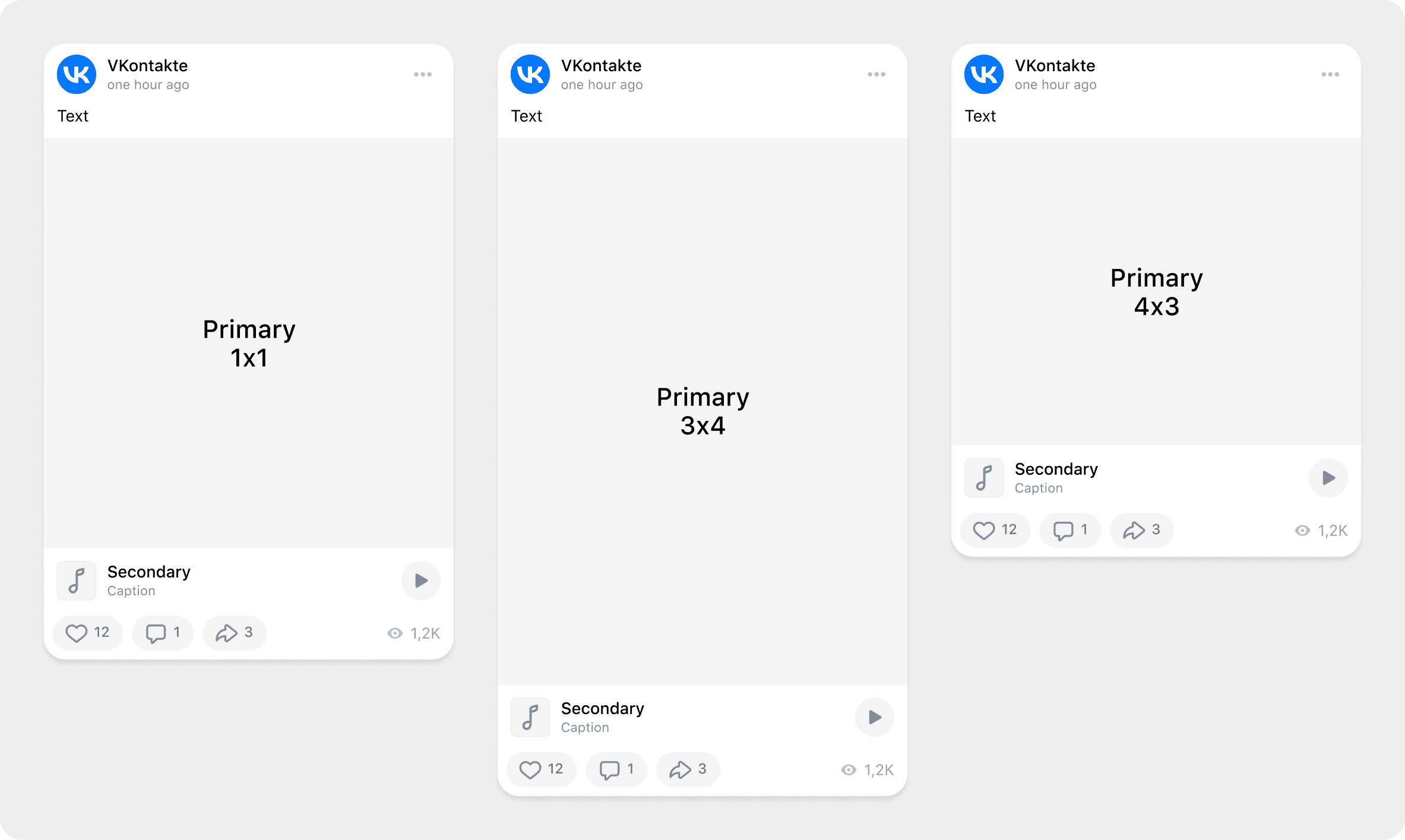
There is a fixed proportion Primary attachment, which has three display formats: square, horizontal, and vertical.
There is also a Secondary attachment, which is any other attachment that comes after the Primary one
This way, we address the problem of post height, as the author will no longer be able to excessively use the height of a photo, and all attachments will appear as unified formats (more on this will be discussed further).
So, we have all agreed on the format, which is great. But how can we ensure that all attachments have a uniform appearance while still visually distinguishing them for the user?
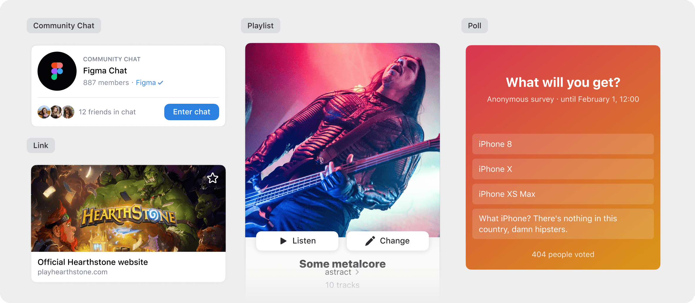
To address this dilemma, I divided Primary attachments into three main types that would cover most needs and suit almost all formats:
Type 1- Media content that plays with just one action for simplified interaction.;
Type 2 - Content that can engage the user;
Type 3 - Content that self-explains what it is Polls are the only format that had to be treated as an exception.
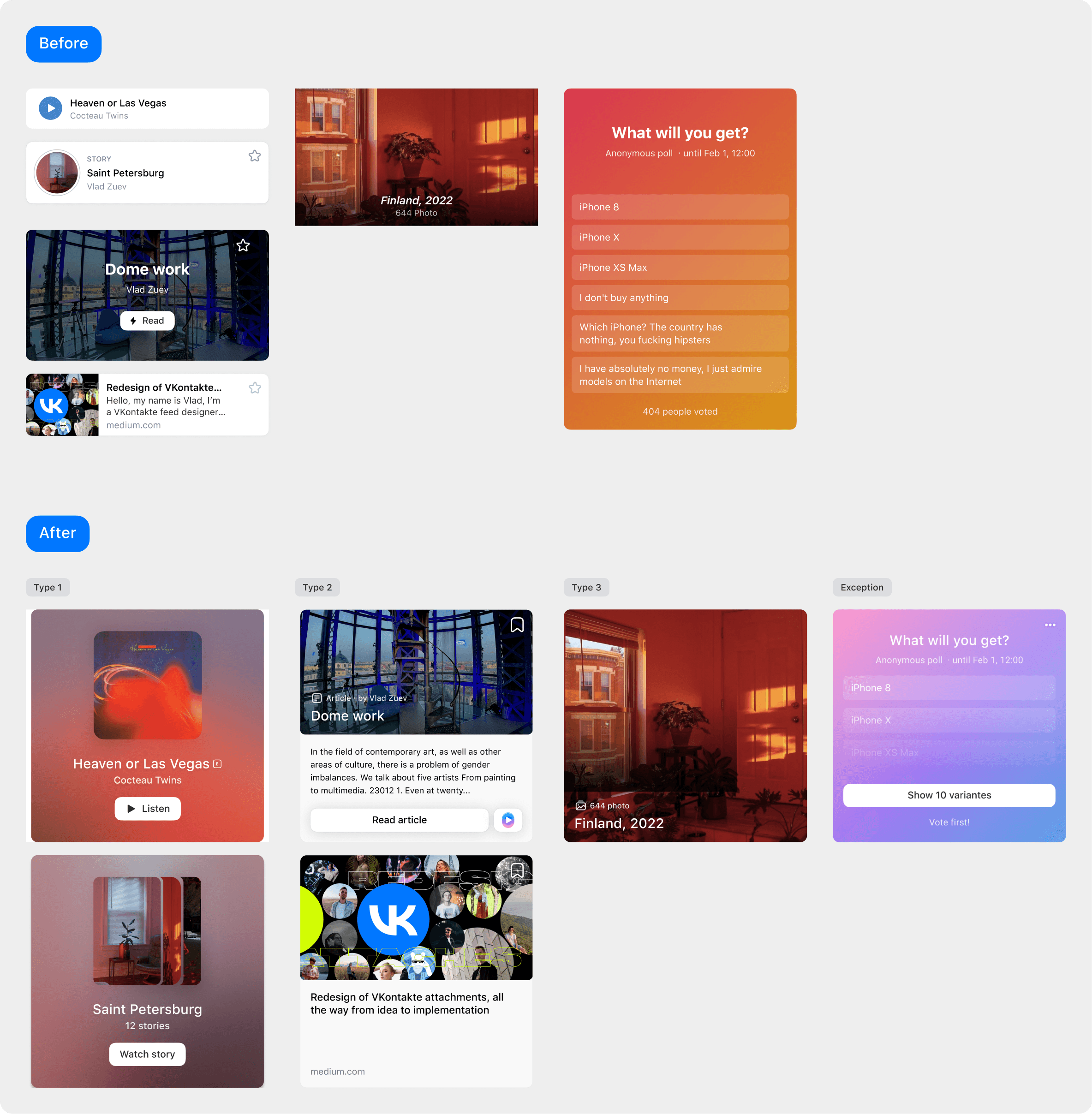
I believe that through the example, you've seen the difference both in the attachments themselves and in the standardization of formats and heights. An interesting fact is that during the implementation phase, I suggested expanding the functionality of articles (displaying part of the information from the article in the attachment), which significantly improved the metrics of this type of attachment and its frequency of use by authors without causing issues for others.
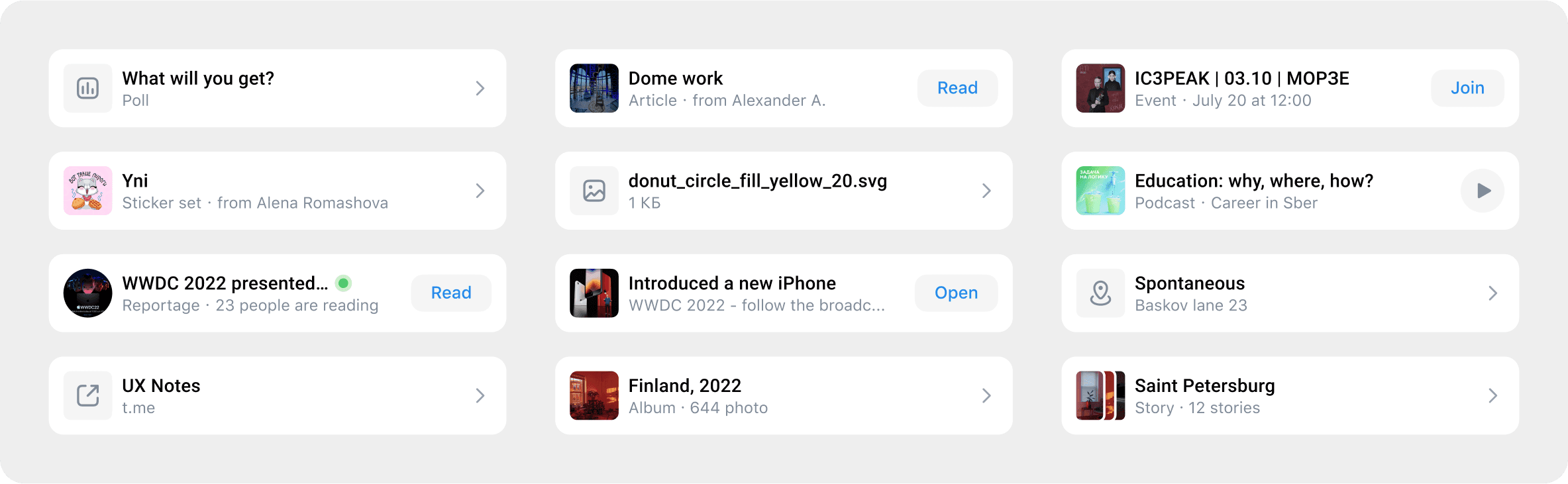
With Secondary attachments, the challenge was to fit the same content into the cell without losing functionality. We arrived at a solution by using a similar division into 3 types:
Attachments with a CTA Button.
Attachments with playback in the feed.
Attachments with a simple transition for viewing.
Problem in the Process
Nothing is ever that simple, right? The problem arose with that small part I briefly mentioned at the beginning of the story.
The issue was that testing attachments was relatively straightforward, but limiting the height of photos that users could add over the years seemed highly doubtful without giving authors the ability to control it. At the same time, we understood that after releasing the new photo format, it would become technically impossible to simultaneously support both the old and new image formats due to server loads and optimization complexities.
To be honest, after forcibly restricting the height of photos, we faced resistance from employees who were part of the experiment, and we reverted everything back.
After much thought, I came up with an option that could be seen as a compromise for everyone, and I named it "Free Height." What is it?
The essence of it is that the height restriction of photos remains within the same parameters of 4x3 (vertical format) and 3x4 (horizontal format), but any format in between is published in its original form to avoid cropping the image or adding a blur to each photo. This logic also worked perfectly for another feature (Carousel), but you can read about that in another article.
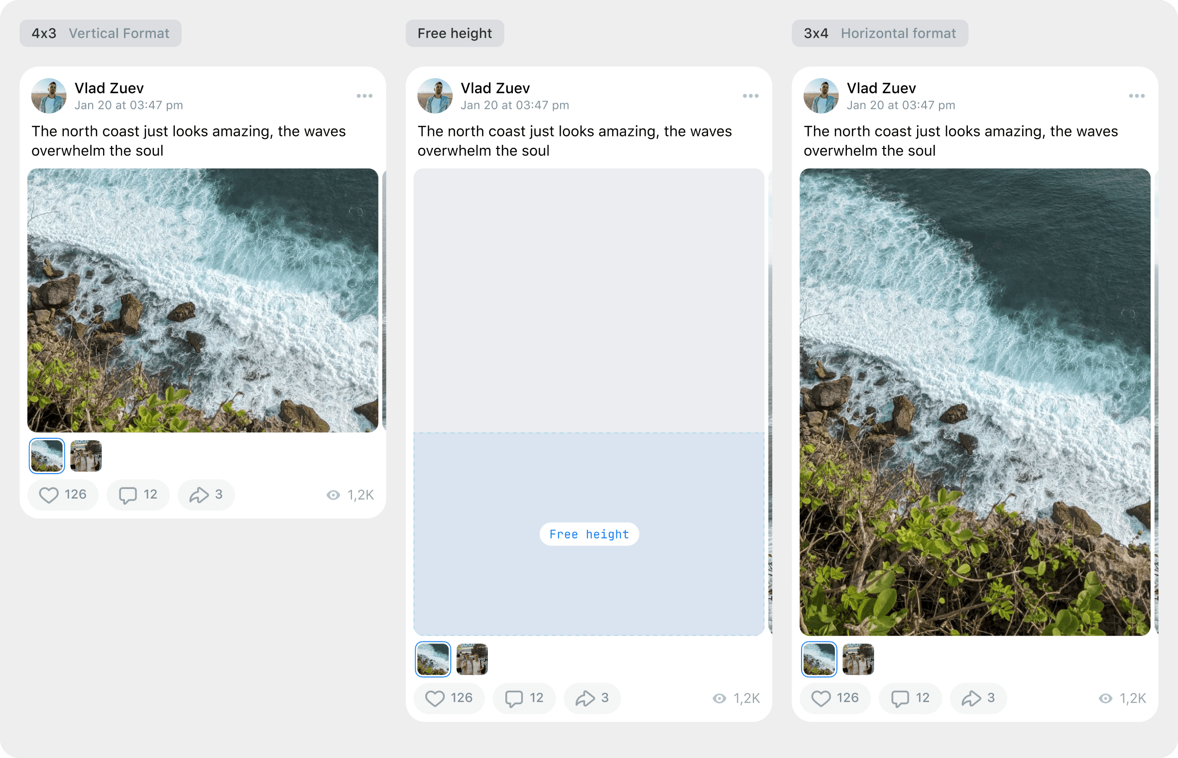
After its launch, this format was well-received by everyone, and thus, we resolved the issue of the height of any media content. As of today, posting is already live, so you can try out the attachment formats yourself.
Result
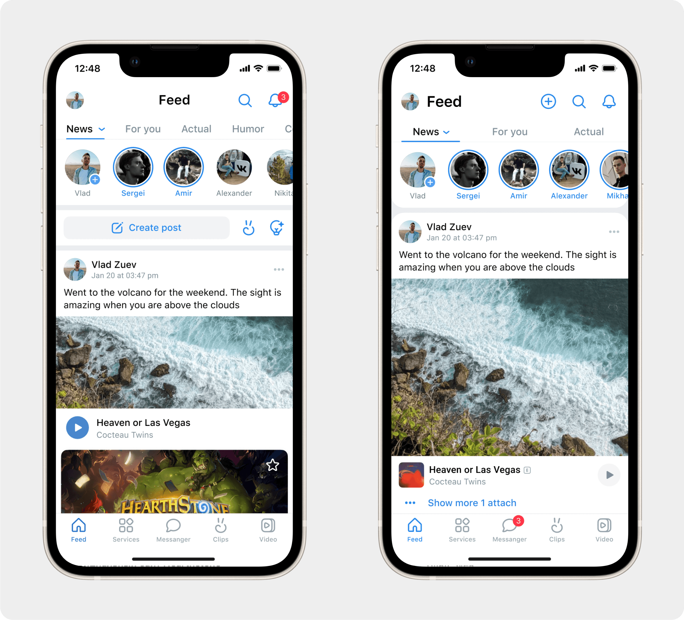
Higher attachment CTR and better prominence of the primary attachment without overloading the feed.
The feed became more structured and predictable: steady rhythm, lower cognitive switching.
Negative feedback on photo height decreased thanks to Free Height: visual posts look complete while the feed remains stable.
Improved cross‑platform consistency (Android/iOS/Web/mVK) and accessibility.
Internally assessed that the redesign paid back the design investment via aggregate engagement gains.
Key learnings: presentation matters as much as algorithms; a unified card system reduces noise and increases trust; behavior‑level compromises (Free Height) outperform rigid constraints.
Next steps: personalise “why this attachment” explanations, add contextual entry points, fine‑tune negative signals.
Go Back