Expanding the Social Graph: “People You May Know”
Redesigned VK’s “People You May Know” to surface trust signals, increase feed visibility, and add user controls—driving meaningful uplift from impressions to clicks and friend requests.
Company
Vkontakte
Role
Product Designer
Product
Friends
Project Overview
Role: Product/Interface Designer
Team: Product Manager, Analyst, iOS/Android/Web Engineers, ML/Recsys, UX Researcher
Scope: Research, hypotheses, UX flows, UI, visual states, micro‑interactions, specs, co‑planning A/B tests
Confidentiality: Specific figures are omitted; results are described qualitatively.
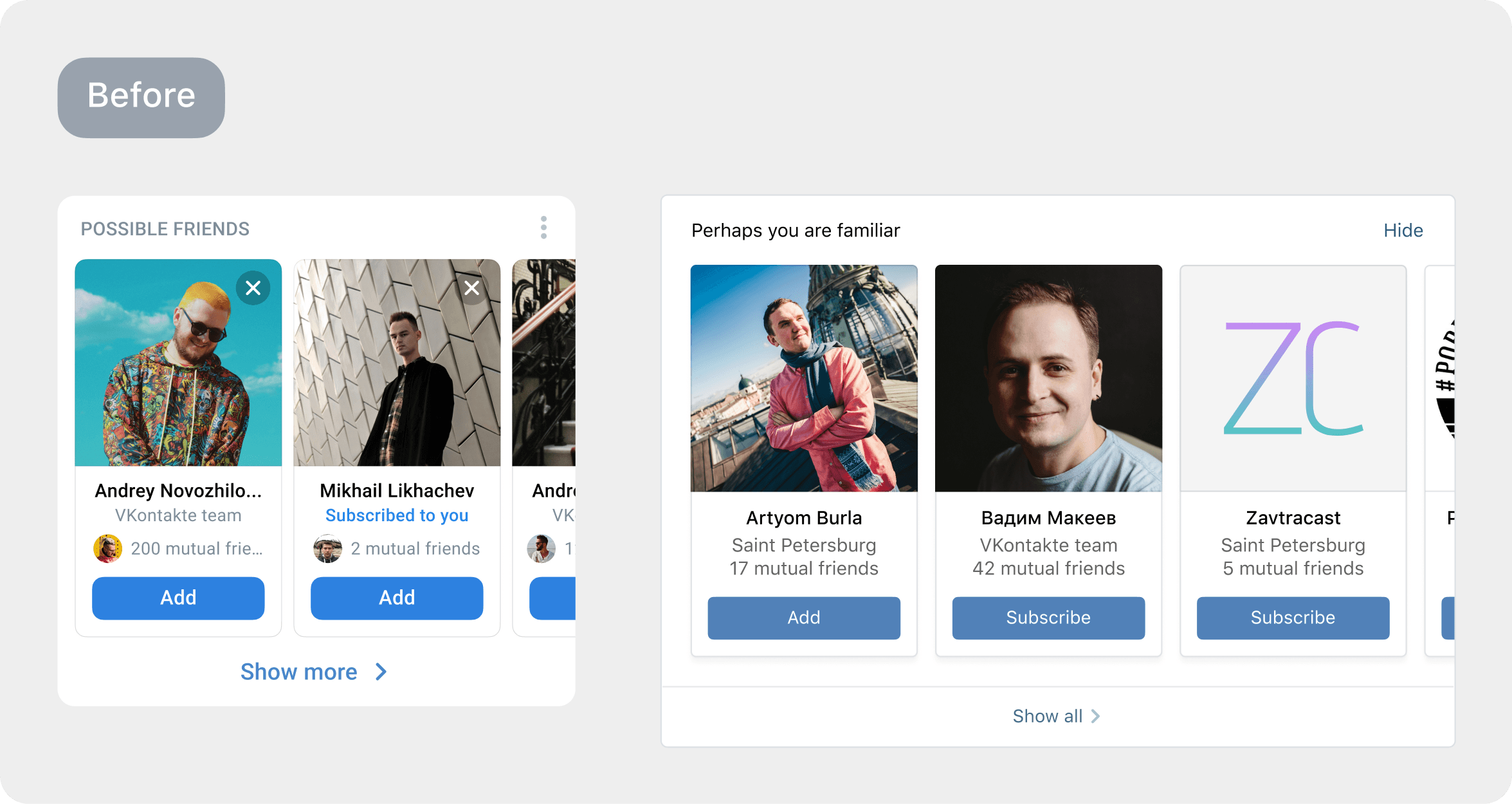
The Friends section is one of the oldest and most used areas of VK. The People You May Know (Possible Friends) mechanism is a relatively new part responsible for expanding the social graph and bringing users back to conversations. At first glance it’s a “standard” block: user cards and an Add button. But this block opened a clear opportunity to grow engagement and time in product through interface improvements.
My goal was to increase the block’s value for users and product metrics without changing the recommendation algorithm (owned by a separate ML team).
Problems
User behavior symptoms (analytics + observation):
Low conversion from card impressions to profile opens / friend requests.
The carousel “blended into” the feed; users often scrolled past it.
Cards felt impersonal: few signals of why this person is being suggested.
Limited control: it wasn’t obvious how to hide irrelevant suggestions or give a negative signal.
Root cause: a mismatch between user expectations and content presentation. Users need a reason to act (mutual friends, shared context—city, school/work, common communities). The interface did not surface that reason.
Constraints:
Do not touch ranking or recommendation sources in v1.
Preserve performance and visual lightness in the feed.
Respect platform specifics (iOS/Android/Web) and accessibility.
Solution
I structured the work into several parallel tracks.
1) Research & hypothesis framing
Funnel: Block shown → Visible in viewport → Tap on person → Profile open → Request/Add.
Qualitative insights: people want context for the connection and reassurance that the suggestion is relevant.
Competitive scan: patterns across Facebook / Instagram / TikTok / Telegram—how they present connections and handle negative signals (“Not interested/Hide”).
JTBD: “Help me quickly find people I know—or want to know—through shared connections, without the hassle of searching.”
Interface hypotheses:
Trust signals on the card (mutual friends, shared communities/school/university/work) ↑ CTR.
Prominent primary CTA (“Add” / “Follow”) with instant feedback ↑ requests sent.
Carousel density & rhythm (3–4 cards per view, stable spacing) improves visibility in the feed.
User control (“Hide”, “Report”, “See fewer like this”) reduces irritation and indirectly lifts conversion.
Micro‑interactions (confirmation animations, skeletons) improve perceived responsiveness.
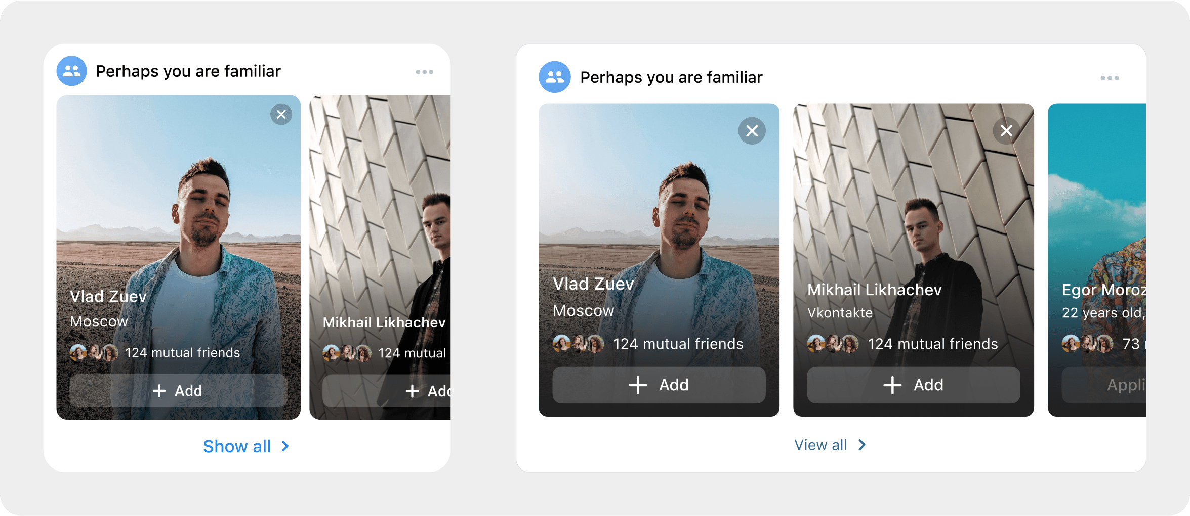
2) Card & block design
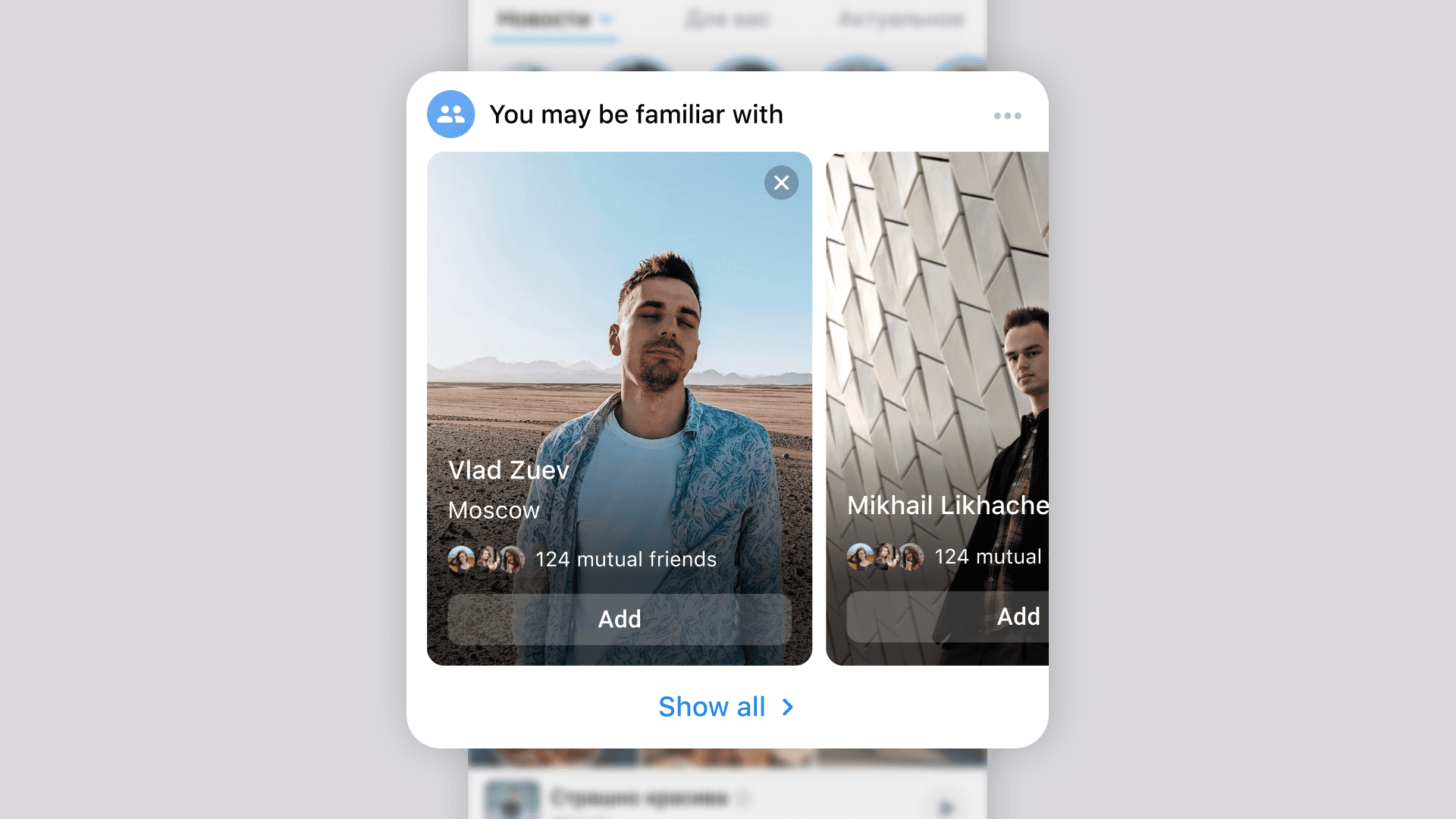
Suggestion card:
Large, well‑cropped avatar → recognition.
Name + secondary line with context: “5 mutual friends”, “Studied together at …”, “From your city”, “Common communities: …”.
Primary CTA: “Add” (post‑tap → “Requested”, with icon/state).
Secondary action: “Profile” (text link/chevron).
Overflow menu: “Not interested”, “Report”, “See fewer like this” (feeds the model with negative signals).
States: default / hover / focus / pressed / loading / disabled / error (with safe rollback).
Placeholders and skeletons for smooth loading.
Block in feed & on the Friends page:
Horizontal carousel with “sticky” edges and swipe pagination.
Friends page variant: denser 2×N grid.
Title with optional helper: “People you may know” + short explanation of why suggestions appear.
Accessibility & localisation:
Contrast ≥ WCAG AA; touch targets ≥ 44×44 px; screen‑reader support.
Proper pluralisation (“1 mutual friend”, “2 mutual friends”, “5 mutual friends”).
3) Scenarios, errors, anti‑spam
Action confirmation with Undo available for a few seconds.
Guard against accidental taps (thresholds / hit areas).
Empty states with explanation and alternatives (search contacts, import).
Limit resurfacing of hidden cards; handle sensitive cases (blocked/blacklist).
4) Experiments & measurement
A/B/C/D variants:
A — current design (control),
B — new card with trust signals,
C — denser carousel,
D — stronger CTA + “why suggested” helper.
Metrics: Card CTR, request CR, add‑friend CR, profile depth, block dismissal, reports, returns to feed, session‑level effects.
Quality: Monitored latency/performance, scroll regressions, and feed FPS stability.
Result
Without disclosing exact numbers:
Meaningful uplift from impressions → clicks and clicks → requests.
Visibility improved while keeping the feed light: fewer blind scroll‑bys.
Added user control, yielding fewer annoying suggestions and better negative signals for ML.
Perceived feed quality improved: stable rhythm, tidy skeletons, predictable states.
By internal assessment, the redesign’s impact was sufficient to “pay back” the design investment via metric gains and growth support.
Key learnings:
It’s not only the model—presentation drives behavior; trust signals on cards change outcomes.
A “small” embedded block can materially affect overall engagement metrics.
Micro‑details (motion, copy, empty states) add up to a visible effect.
Next steps:
Personalise “why suggested” explanations.
Add more contextual entry points (from a friend’s profile, communities, search results).
Fine‑tune negative signals (“fewer people from school/city/communities”).
Go Back