Information Unification in a Post
Unified post metadata into a compact, consistent system that reduced post height and boosted clarity and engagement.
Company
Vkontakte
Role
Product Designer
Product
Newsfeed

Project Overview
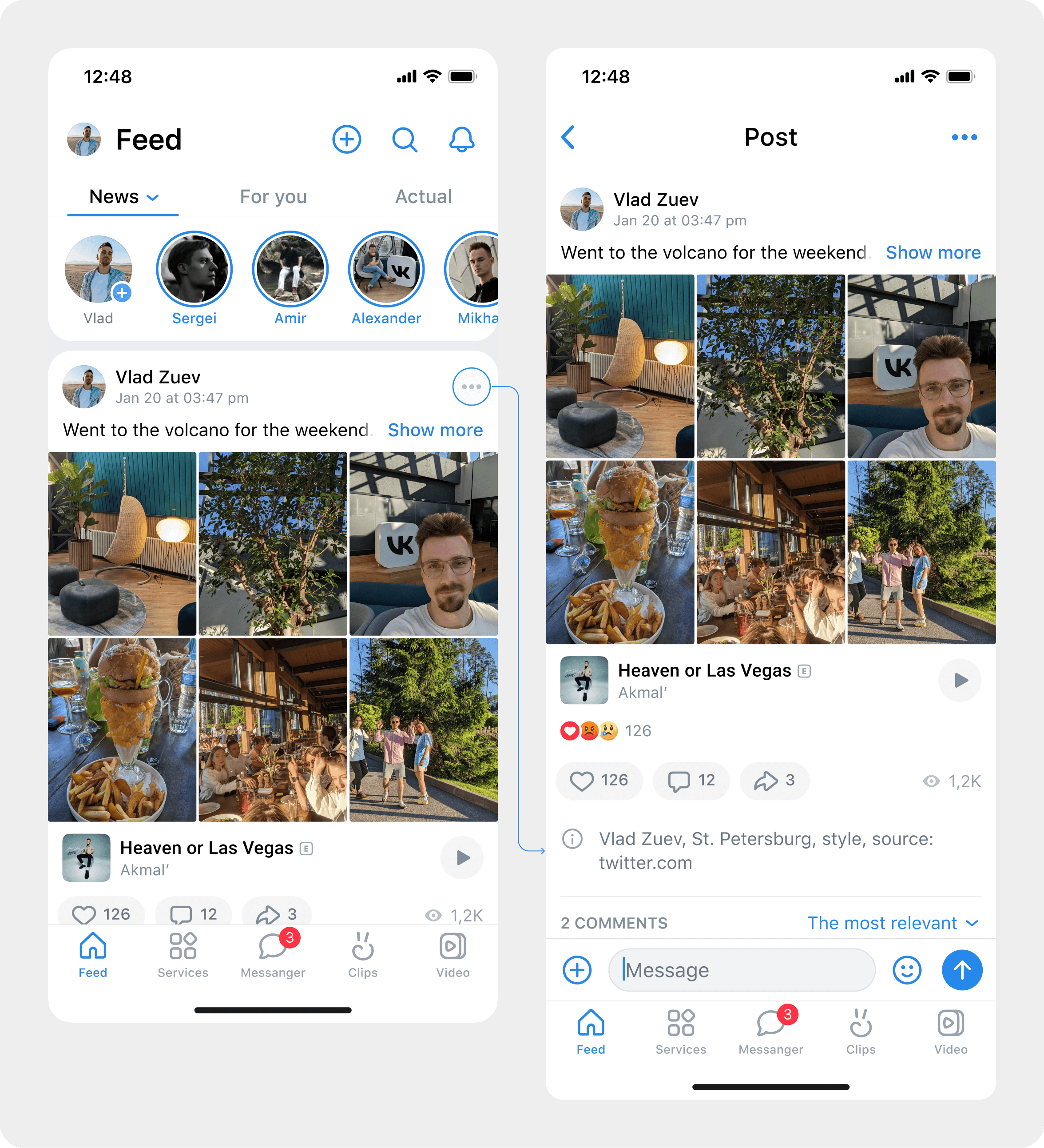
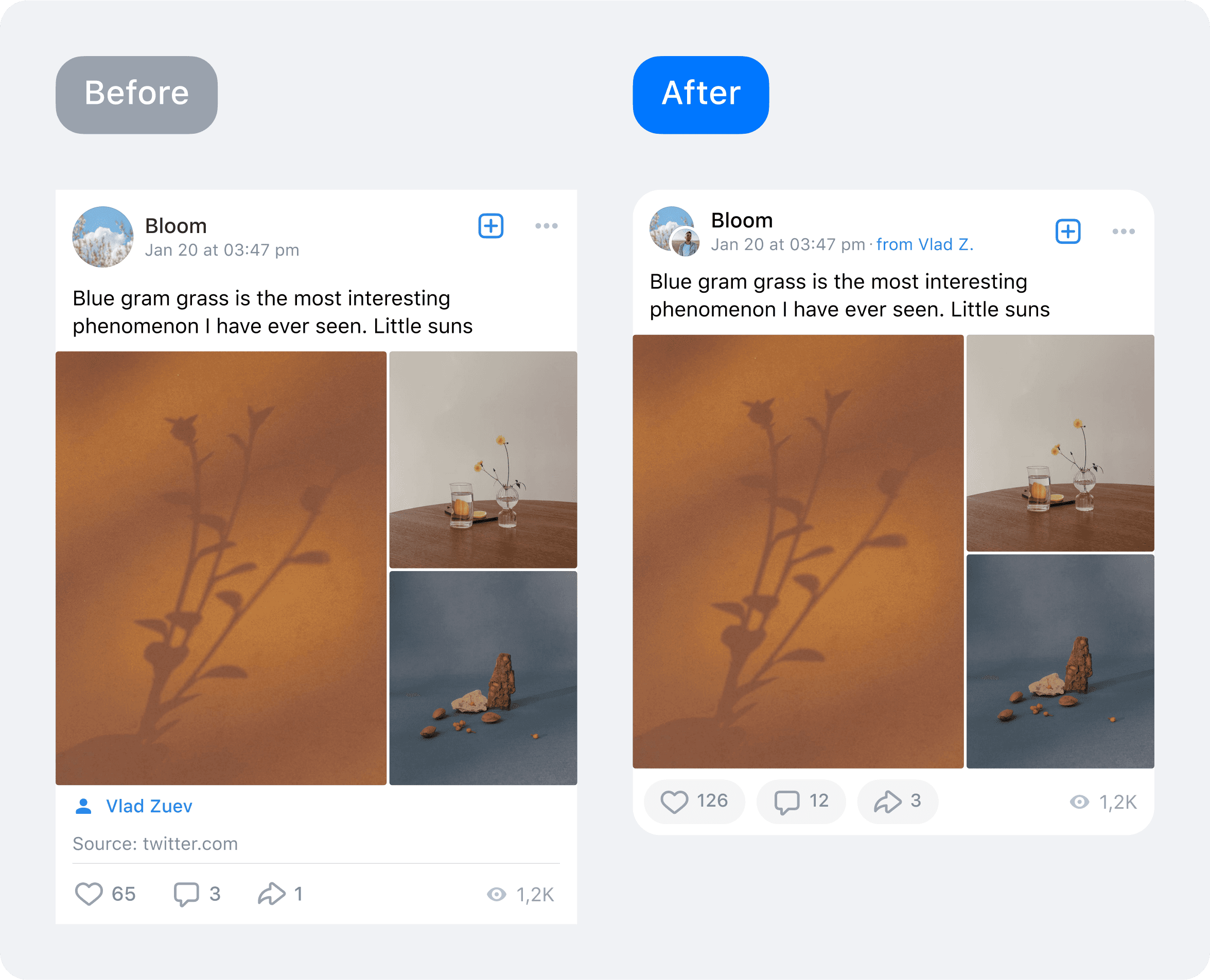
Beyond primary content, VK posts carry metadata and service info: geotag, source link, hashtags, reading time, author/avatar, date/time, attachment captions, etc. Historically, these elements appeared in different places, got duplicated, and inflated post height, hurting readability and feed predictability. The goal was to unify metadata into a single system and entry point, reduce post height, and make interactions consistent across platforms.
Problems
Symptoms (analytics + observation):
Metadata scattered across the post (header/footer/inside attachments) → tall posts, noise, lost focus.
Inconsistent action patterns across formats/communities → low predictability and extra cognitive switching.
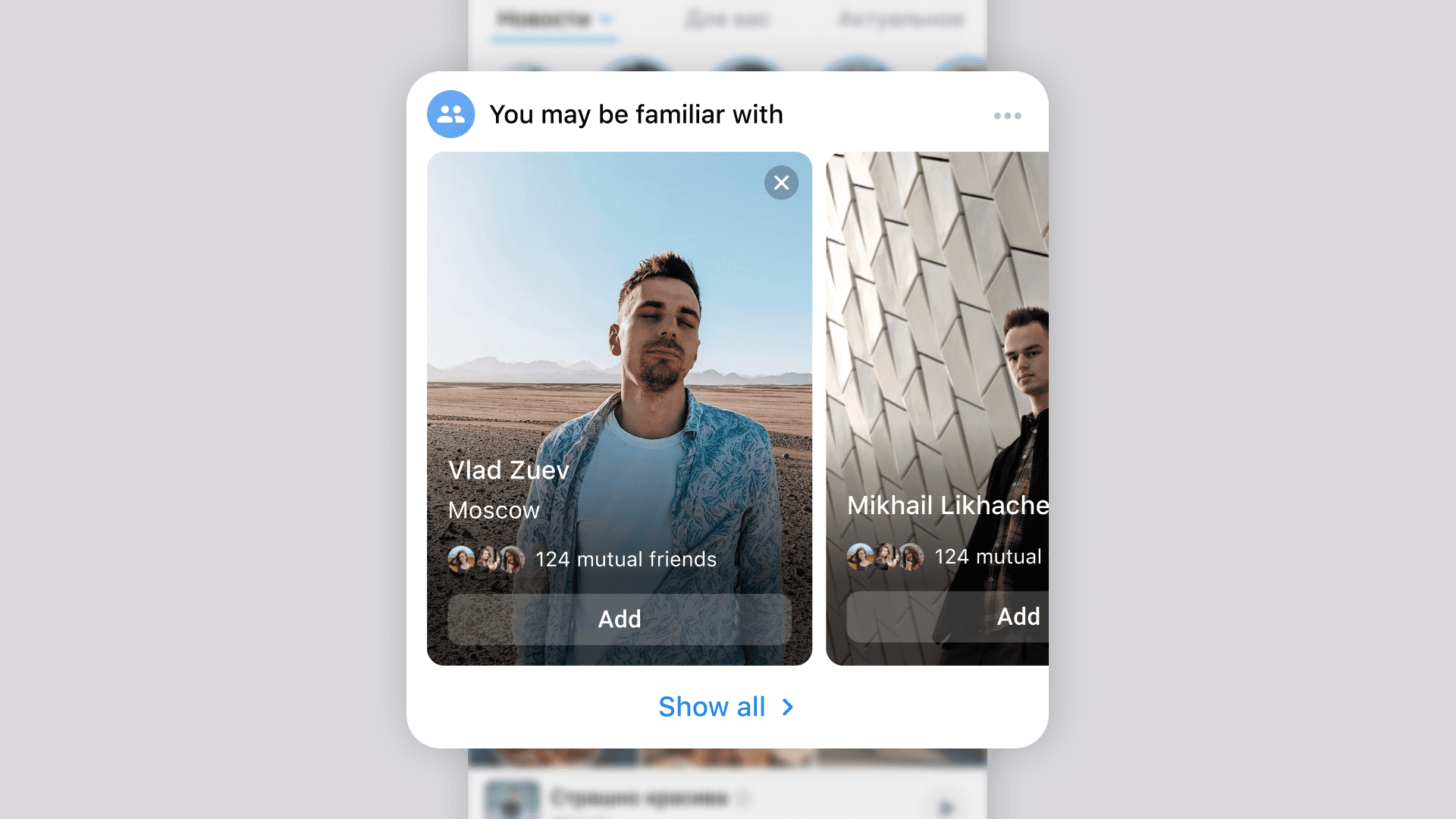
Duplication (avatar/name/date, hashtags, etc.) → visual overload, especially in auto‑feeds.
Divergent implementations on Android/iOS/Web → uneven experience and maintenance complexity.
Constraints:
No ranking changes.
Keep scrolling light with stable FPS.
Meet accessibility and localisation requirements.
Solution
Work spanned three layers: information architecture → interface → behavior.
1) Information architecture
Canonicalised metadata set: author/avatar, time/date, geo, source, hashtags, attachment type, reading time, etc.
Zoned the post: top service bar (header), content block, actions area.
Removed duplication, set priorities: critical near the title; secondary compact and collapsible.
2) Unified metadata interface
Built a compact metadata bar below the title: icons + concise labels; grid‑based layout; overflow control (ellipsis/chip‑fold).
Unified click targets: geo → map, source → external link, hashtag → search, reading time → anchor to start.
Standardised avatar size, spacing, typographic hierarchy; states for hover/focus/pressed/disabled.
3) Behavior & micro‑interactions
Smart wrapping and collapsing of rare metadata (chevron/expand).
First‑use hints (tooltips); smooth motion without layout shifts.
Empty states and error handling for external links/geo.
4) Experiments & quality
A/B variants: control; compact metadata bar; bar + unified actions.
Metrics: post height, CTR on metadata (geo/source/hashtag), depth of profile/community views, collapses, returns, session impact.
Quality: feed FPS stability, no jank, correct operation on Android/iOS/Web/mVK.
Result
Reduced average post height while keeping full info one tap away.
Improved readability & predictability: single metadata zone lowers cognitive switching.
Higher engagement with profiles/communities via clear, visible entry points (geo, source).
Better cross‑platform consistency and accessibility.
Key learnings: standardising “small things” in the feed drives visible behavior change; compact presentation + smart collapsing beats hard cuts; unification lowers maintenance costs.
Next steps: personalised metadata display; better explainability (“why I see this”); more contextual entry points.
Details can be found in the article at the link.
Go Back